Legend Pay is a solution for easier, faster and safer payments for purchases in the Legend eco-system. Users simply carry out transactions from their mobile devices at your convenience.
From the design perspective, the goal was to create an elegant, simple and engaging application focused on easing payments in the Legend eco-system.
In the course of approximately 2weeks, I designed all of the pages for phase 1 of the project and then worked closely with the development team to make sure that its final form looked as intended. We were extremely happy that the project succeeded.
1. Defining the Problem
2. Framing the solution
3. Developing the Solution
4. Finalising the solution
5. Reflection
From the document presented by Legend, we had to extract what the design should look like and how the userflow should be. We also made sure the app emphasied the following:
1. Payments should be easy
2. Subscription renewals should take few steps
3. Countdown for subscription
What am I designing?
An experience that allows Legend users to pay for products and services convieniently.
Who is this for?
This is for new and current Legend users.
When and where will this be used?
It will be used after the a person signs up for a Legend account and can be used anywhere.
Why is this important?
Being able to ease payments as the current process is complicated and done physically.
Challenge
How might we design a mobile platform to ease payment for Legend services and also help merchants sell services and products.
Design Principles
1. Accessibility & Inclusiveness
2. Convenience
3. Personal
Users
1. Legend User
2. Legend Merchant
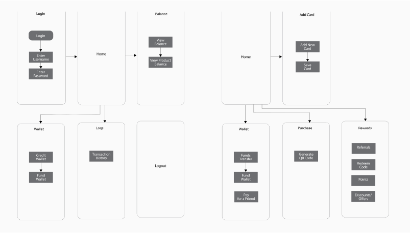
Initial Oversimplified Architecture

The solution we chose to implement had to be as effective as possible while being as simple and elegant as possible.
The biggest challenge of this project was not only time constraint but also lack of proper research. This took a hit on the design process as it focused more on visual interface design rather than user experience.
Despite the contraints, I am happy with the way the design turned out as we came out with something meaningful that the client really loved.
In the future, I plan on making emphasis on research with the cleint and also ask for a reasonable timeframe for delivery.

I’d like to take this opportunity to thank you for finding my work so interesting that you made it to the end.